Singapore Trip
Each semester during the mid-term break we go to site visit trip. This semester our site visit was to Singapore, mainly because our main design project is animation studios and hence to visit the Universal studios in Singapore. The task for our Communication and Visualisation subject was to take 100 Pictures: 80 Buildings and 20 Interior.
The 80 façade
 |
1. This building caught my because of the exterior colour. Its all black with horizontal rectangular windows with its rigid square shape shows how bold the architect of the building is.
|
 |
2. This building stand out itself from the rest because of its many large windows and the grey paint of it.
|
 |
3.The shape of this building is very interesting to me: the way that one corner of it is made round and then the other is cut of straight and decrease the volume of it as it goes up.
|
 |
4. The Octagonal shape, the shape of roof and the colour makes the building visible from the rest of the landscape.
|
 |
5. The bold shape of the building and the excess use of glass for the façade gives this building a very modern look and harmonise with rest of the city's buildings.
|
 |
6. The distinctive part of this building is the extrusion of the cuboid in the façade.
|
 |
7. What i liked about this building is the mixture of Eco and Futuristic, and how they are combined together into one building.
|
 |
8. The combination of many different shapes and how each different shape compliment with each other makes this whole building looks unique even if it has the same style as the surrounding city's buildings.
|
 |
9. This Buildings façade was selected because of the traditional way it is constructed and how the brightly colour makes it look more beautiful.
|
 |
10. The building structure is very traditional but the contrast of colours from window to wall makes the building look more lively.
|
 |
11. This is the façade of a simple parking lot, but the way that the colours are used brightens up the building making it not look boring.
|
 |
12. The façade of a traditional looking building with different colours liven the area.
|
 |
13. The simple use of colour to highlight the columns and windows changes the building from simple to exciting.
|
 |
| 14. The angular façade and the tower, large windows makes the building unique and noticeable from the surrounding. |
 |
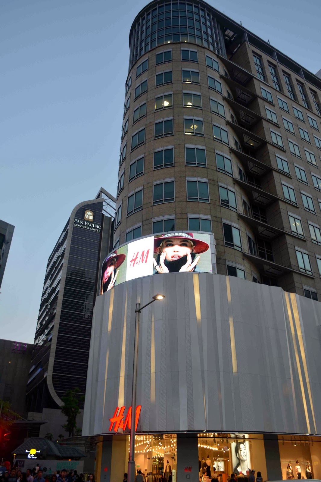
15.This building would have looked very simple or even have blended into the surrounding if it wasn't for the white curvy design that blends into the structure.
|
 |
| 16. The angular flat and curved façade with unfinished looked makes you see an aged building |
 |
| 17. The huge openings and stairs which are not to human scale makes the building look majestic. |
 |
18. The round part of the façade makes it distinctive.
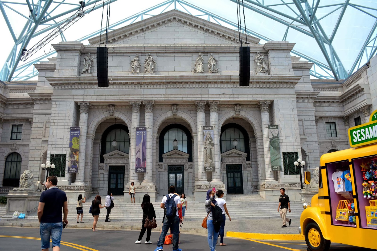
|
 |
19. The white colour and the columns makes the building very royal.
|
 |
20. Extruded façade with the use of green.
|
 |
21. Simple yet colourful building, very eye catching.
|
 |
22. Each block has a different colour making it exceptional from the surrounding.
|
 |
23. The details, columns, white colour and the yellow lightings gives out a very royal majestic feeling.
|
 |
24. The curve in the building with all glass façade, makes it look very modern.
|
 |
25. There is repetition in the building and suddenly on the top have extruded floors breaking away from the repetition.
|
 |
| 26. The stretched façade to the whole block is combined with buildings with different style. |
 |
| 27. Very symmetric but a unique method of columns. |
 |
| 28. The white colour and the traditional design makes it look very elegant. |
 |
| 29. The design and the colours makes the building very Indian. |
 |
| 30. The straighten corner creating a façade for the building. |
 |
| 31. A very futuristic and unique design, like a floating ship top of the buildings. |
 |
32. Looks like a tulip flower opening, a very unique design for a building.
|
 |
| 33. The big columns and the heaviness in horizontally makes the building very royal and elegant. |
 |
| 34. The very large opening and glass faced shows the beautiful design of the inside looking very welcoming. |
 |
35. A very old design mixed together with the modern buildings and stores.
|
 |
| 36. beautiful structure with the use of traditional style and unfinished walls. |
 |
| 37. Black and an orange brown with very graceful look. |
 |
| 38. Very direct and straight with horizontal windows around the building. |
 |
| 39. A very simple design with lots of windows and easy for the eyes to look.. |
 |
| 40. Old traditional royal design looks very classic. |
 |
41. This building is made to a Chinese theme with decorated roof and with square structure.
42. This was a hotel nearby the place we were staying. Simple design like a square and a round corner to break away from the rigidity.
43. A very futuristic design with metallic look with an angular façade.
44. A very futuristic design with metallic look with an angular façade.
45. The façade of the universal studios.
46. The main store for merchandise in universal studio, tries to give out LA feeling.
47. A façade imitating as a garage in Hollywood..
48. Another façade of universal studios store.
 49. A theatre in the universal studios, the façade is design to give out the New york feeling to visitors.
50. A façade of another theatre with a theme of sesame streets in New York
51. A façade created in a the sesame street theme to sell their merchandise.
52. A façades created to give out the ambience of the busy New York shops.
 53. A replica of New York library's façade to give out the feeling of walking in the streets of New York for the visitors.
54. A façade of a theatre, together with light posts just for the New York effect.
55. A façade created in Egyptian theme, the whole façade and the anubis are larger than human scale, to give out power and mighty feeling of the Egyptian Pharaohs to the visitors.
56. Gardens by the bay: Man-made structures within the nature.
57. the staircase to the marina bay sands the circular ceiling also is a platform where you can over look the gardens.
58. A building in gardens by the bay, the structure from this angle looks like a sinking ship.
59. The façade of marina barrage, the roof of this whole building is covered with natural grass
. 60. A very tall building with circular features.
61. The façade of tang plaza using of Chinese architectural roofs
62. The façade of a mall in Orchard road, very angular and futuristic design. The design changes from solid angular structure to glass angular structure.
63. The building style is using Chinese architectural style, the octagonal shape and the roof.
64. The façade of tang plaza using of Chinese architectural roofs
80. The façade caught my eye to the unique way its trying to break away from the rectangular shape, which concludes the 80 pics of building.
The 20 Interior
|


No comments:
Post a Comment